Aula is the Learning Experience Platform for higher education. With a unique combination of easy-to-use technology and learning design, Aula makes it easy for educators to create learning experiences that truly engage students.
Company
Aula Education
Timeframe
Apr 2020–Nov 2021
Challenges and goals
Creating engaging learning experiences
As universities move towards more flexible delivery, creating a learning experience with an engaged learning community has proven critical to student success. However, educators just don't have the time to do it. As a result, universities are limited in their ability to retain and graduate more students every year. Students who feel connected to their learning community are more likely to persist, yet most digital learning platforms create isolated learning experiences. Aula combines easy-to-use technology with evidence-informed learning design to create community-first learning experiences that are as much about meaningful connection as they are about academic challenge.
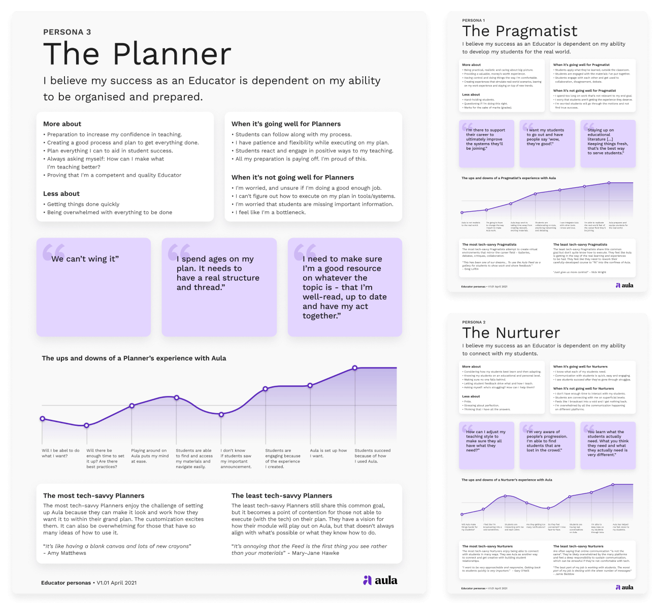
I had a leading role redefining our personas. These are some posters that came out of this project.
My role and the team
Building the foundations of the team
When I first joined Aula, in April 2020, I was the only designer in the company. It was my responsibility to bring a focus on the user to the core of our company culture, and to grow and manage the Design team. During my time with Aula, I have led and coordinated all core design initiatives, including establishing user research processes, creating a consistent and accessible design system, improving cross-functional collaboration, hiring and managing the members of the Design team and setting up team rituals and practices.
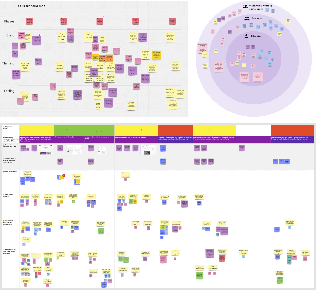
Screenshots from various design thinking activities that we ran with the team.
Key focus area
Product design
I oversaw the design of all of Aula's digital products, such as the web app and the mobile apps, managing the designers on the team and getting involved in hands-on work myself. A key initiative that I led was creating and evolving a design system that brought some much needed consistency to Aula's apps. The design system also helped us be much more efficient when designing and implementing UI, and drastically improved the accessibility of our products, getting us closer to our vision where every learner is empowered to reach their full potential.
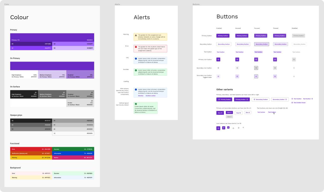
A small part of the design system I created for Aula.
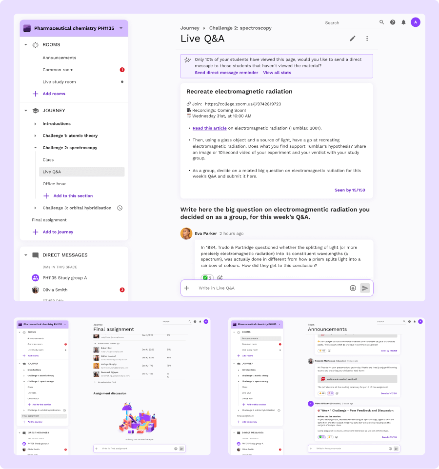
Great importance was given to user research at all times. We ran frequent user interviews and used other research techniques such as surveys to make sure we were addressing real need and pain points in a way that was simple yet suitable for complex real-world educational scenarios. We also used these learnings to redefine the information architecture of our products, to match our users' mental model and to make sure that we could grow the apps in a scalable way.
A few of the explorations for Aula's information architecture redesign.
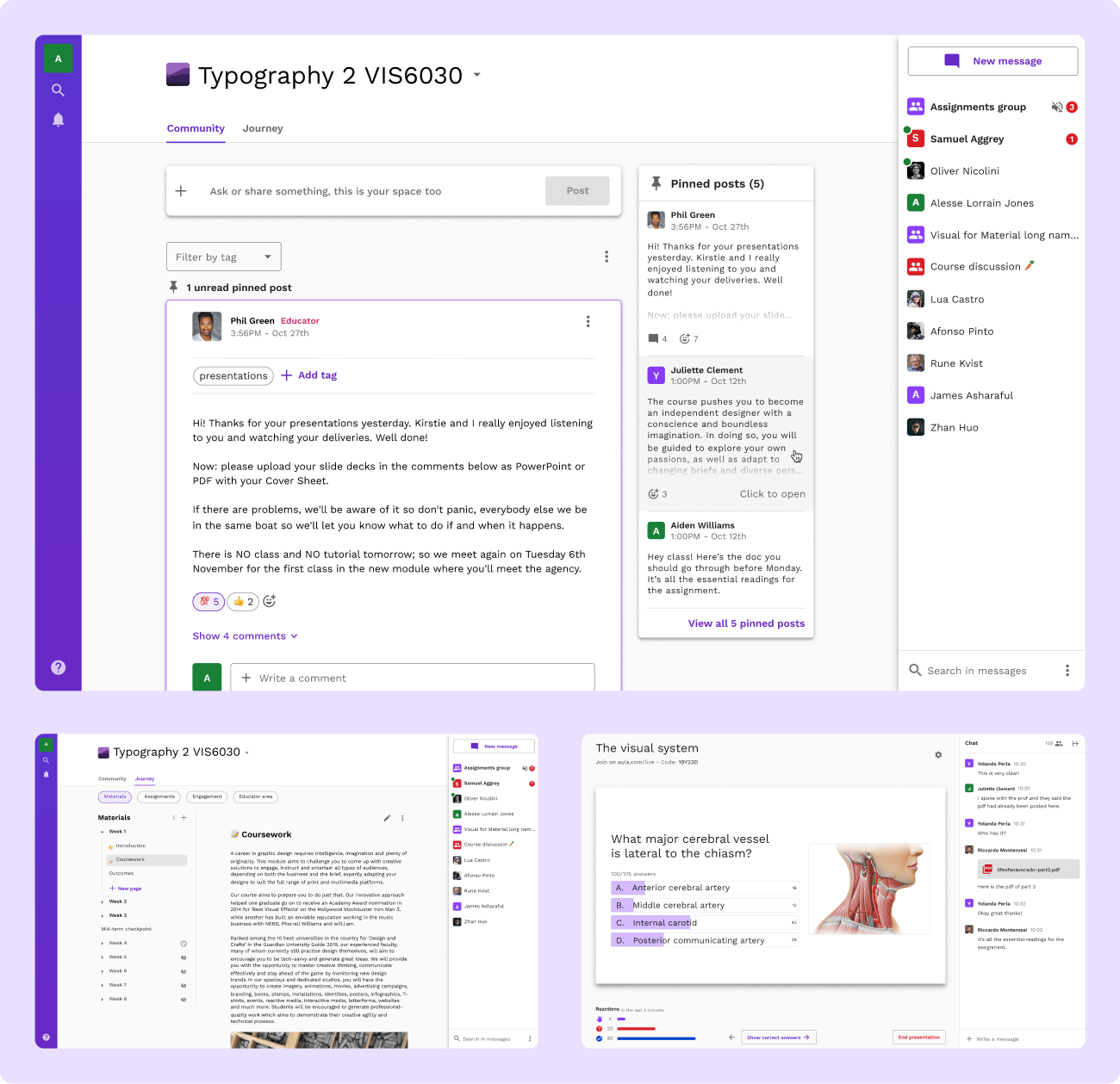
These principles were key to deep redesigns of both our mobile and desktop offerings. Users appreciated how much easier to use the new interfaces are. We also caught the change to fix the accessibility issues and make the visual language more consistent.
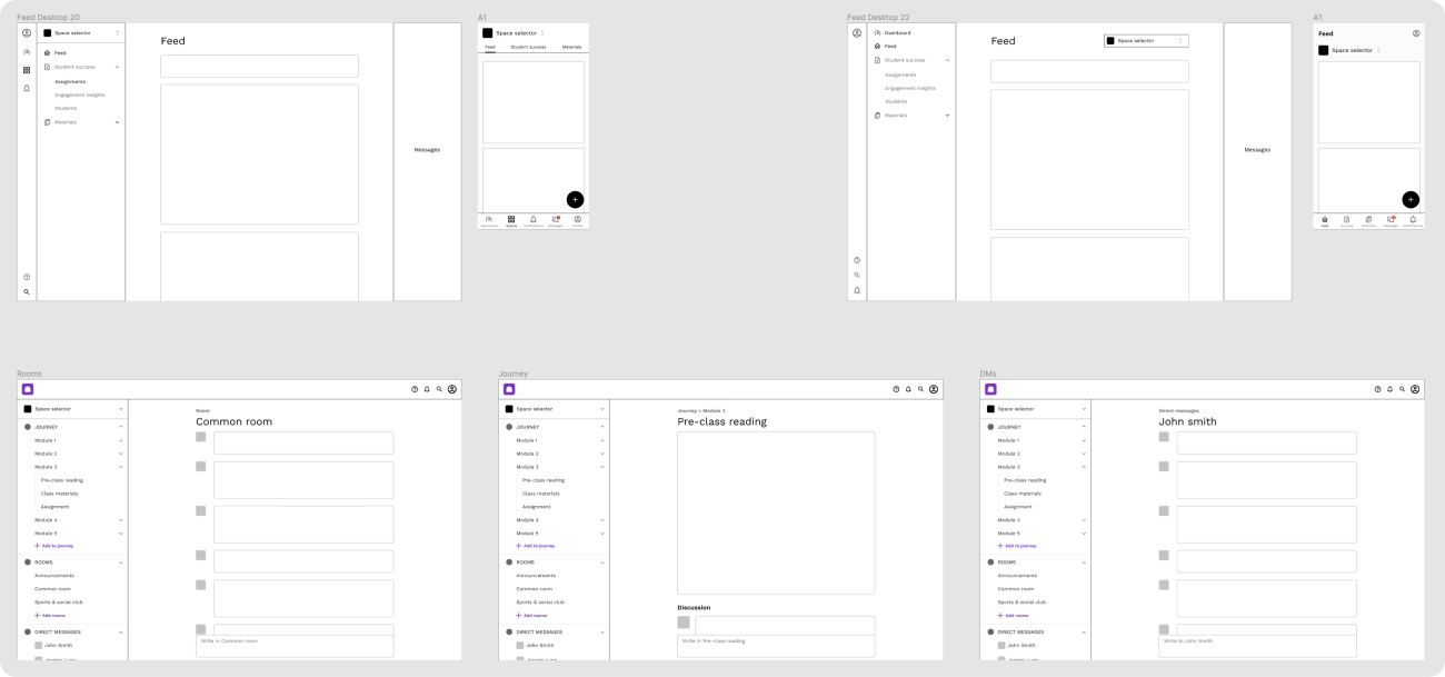
Key screens from the current desktop app.The redesigned mobile app (right) improves information architecture, accessibility and visual consistency of the old app (left).
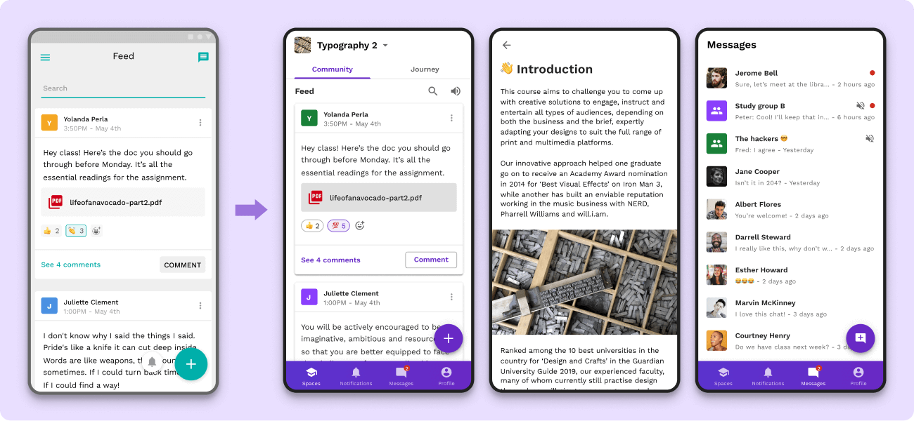
As Aula as a company evolves and as we learn more about our users and the market, so we evolve our product. We are always testing and exploring new ideas to make teaching and learning more engaging.
A few screens from one of the concepts we have tested with our users to inform what's next for Aula.
A new look for Aula
A deep rebranding
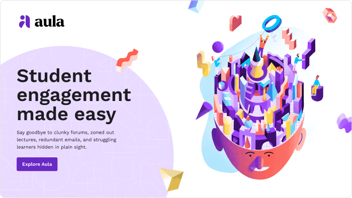
In the Summer of 2021, I proposed and led the design of a new brand identity for Aula, centered around learning and community. This brought a friendly, authentic, simple yet distinctive personality to Aula's visuals.
A key visual featuring the new Aula logo and some illustrative elements.
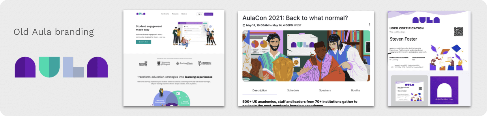
There were many reasons for this change. The old brand identity was playful and helped us grow as a company. However, as Aula evolved as a company, we outgrew it. A colour palette of mostly purple and teal limited the combinations that would work visually while also being accessible. Accessibility and inclusion are extremely important at Aula, so this had to be fixed. We appreciated the geometric simplicity of our old logo, but it had poor legibility. The "A" in the old app icon was not easily recognisable. Finally, over time, different illustration styles and uses of the logo made consistency an issue.
The old Aula branding lacked a sense of cohesion.
Starting from the concepts of connection, collaboration, and engaging learning experiences, we worked to evolve Aula's look and feel. The new identity is still friendly and simple but at the same time it feels recognisable and mature.
A sample layout using the new Aula branding.
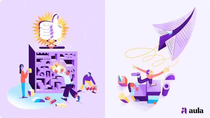
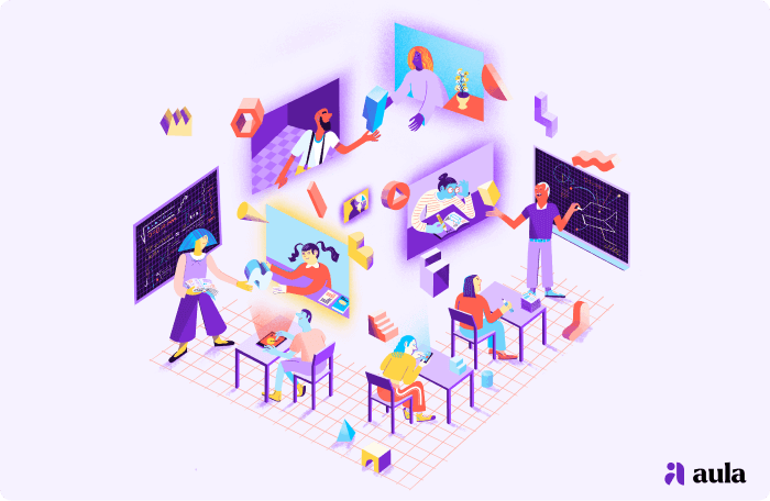
The new logo evolves the geometric theme of the old one while also being distinctive and legible. The new illustrations, created in collaboration with the talented illustrator Francesco Fidani, show a diverse learning community exchanging ideas and knowledge in many different ways. The result is a visual branding that fully expresses Aula's ways of being direct but respectful, optimistic but practical, conversational but not too informal, and friendly but authentic.
The new Aula illustrations, created by Francesco Fidani, show a diverse learning community.
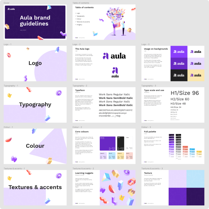
In addition to working on the visuals for the rebranding, I directly coordinated the launch of the new identity, to make sure that the teams responsible for Aula's many touchpoints (e.g., apps, social media, help centre) were updated at the same time. I also provided detailed branding guidelines, which was something that Aula severely needed.
A small portion of the branding guidelines document that resulted from this project.
Outcomes
A measurable impact
My work has contributed to an increase of over 300% in the number of educators that are very satisfied with Aula. When asked what they like about Aula, users consistently mention how the interface is attractive, modern and easy to use. This improvement was instrumental in getting Aula to sign their first full-scale enterprise customers and is having a measurable impact in allowing the company to expand to additional markets.